
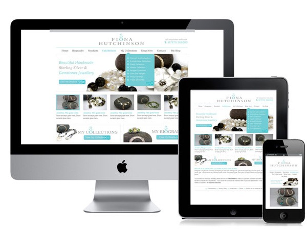
In this blog post we wrote some words about how to design a newsletter so it can be read on a smartphone, tablet, laptop and desktop computer without modifications. The email will adapt itself automatically to the width of the display / screen. This is called responsive email design and in the following blog post, written by Christian Vasile, you will find more details about how to utilize responsive email design to design a newsletter so it can be read on devices with very different display widths:
> Responsive Email Newsletter Design: Increase Mobile Readership
We also recommend you to read this article on our web site; it contains information about how to design an email newsletter for a mobile phone and smartphone:
> How to Create a Newsletter for a Mobile Phone & Smartphone