|


 Adapt a newsletter for different display width (with the @media rule) 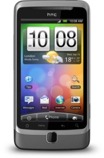 If you are familiar with HTML and style sheets (CSS) you can create an
e-mail
newsletter that is automatically adapted to the width of the screen /
display. You can do this by using the media query rule (@media).
If you want create an e-mail newsletter that is optimized for both computer
monitors and mobile phone / smartphone displays (and also tablets like
iPad) you can use this rule. If you are familiar with HTML and style sheets (CSS) you can create an
e-mail
newsletter that is automatically adapted to the width of the screen /
display. You can do this by using the media query rule (@media).
If you want create an e-mail newsletter that is optimized for both computer
monitors and mobile phone / smartphone displays (and also tablets like
iPad) you can use this rule. Not only can the width of the newsletter be adjusted to fit well in the display. Also the font size, margins and picture width and height, and other parts of a newsletter, can be adjusted automatically by using the media query rule. The example below shows how the @media rule can be used:
In the example above the size information and font sizes will only be used if the display is 480 pixels wide or less. If the display is wider the information above will not be used; instead are the standard settings used. In this way you can create newsletters that look great in both computer monitors and mobile phone / smartphone displays. Many older mobile phones and smartphones do not support the @media rule, but then is the script above ignored and the ordinary settings are used instead. So it is risk free to use @media in this way. The @media rule is only used if it is recognized by the browser or e-mail client, and if the conditions are right.
Read more about the @media rule More information about the @media rule is available on these pages:  https://www.w3.org/TR/css3-mediaqueries/ https://www.w3.org/TR/CSS21/syndata.html https://www.w3.org/TR/css3-mediaqueries/ https://www.w3.org/TR/CSS21/syndata.html<< Go Back (to the article: 'How to Create a Newsletter for a Mobile Phone & Smartphone') |