|


Comparison of newsletter campaigns (Area chart)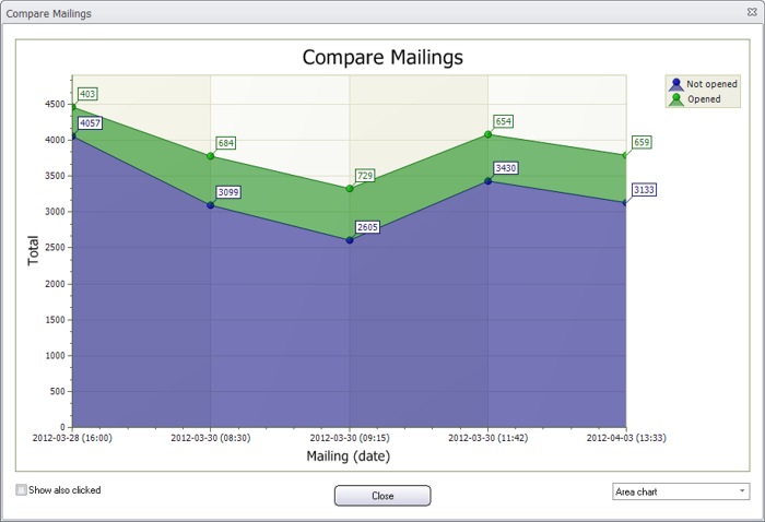 In MultiMailer it is easy to compare newsletter campaigns with each other. The result is displayed in different types of charts (diagrams). Above is an example of an area chart where 5 e-mail campaigns are compared with each other. The green color shows the number of opened newsletters and the blue color shows the number of not opened newsletters. The date and time at the X axis shows the e-mail delivery date and time. < Go back |