
Mobile E-mail
How to Create a Newsletter for a Mobile Phone & Smartphone

 Mobile
e-mail is very common today. People often read e-mails, including
newsletters, on their mobile phone or smartphone. The display (screen) on mobile
phones are much larger today than before so there is no problem to read
e-mail messages directly on the phone, provided that the e-mail is not too large
in size (not too wide or too long). Mobile
e-mail is very common today. People often read e-mails, including
newsletters, on their mobile phone or smartphone. The display (screen) on mobile
phones are much larger today than before so there is no problem to read
e-mail messages directly on the phone, provided that the e-mail is not too large
in size (not too wide or too long).
A few years ago images in a newsletter could be a major problem
and cause irritation because it took a long time to download the images,
but today the Internet connections for mobile phones are so fast that ordinary images are
no problem anymore, in terms of speed. They are downloaded immediately,
just as for broadband connections. Using Internet through a mobile phone
is also cheaper now than before, and often you only pay a fixed monthly
rate no matter how much information you download from the Internet to
your mobile phone. Mobile phones of today have also larger storage
memory than before so the risk that downloading many e-mails will
consume all available memory is very small.
Today's cell phones have become more computer-like and so smart that
they now are like small computers, or PDAs. Therefore, a new naming
concept has been created when referring to the most advanced models: a
smartphone. One of the most famous and best-selling smart phone
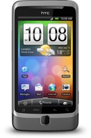
today is Apple's iPhone, but Samsung Galaxy is also popular. Also HTC
has several popular phone models, such as HTC Desire.
To Create and Design a Newsletter
for a Mobile Phone and Smartphone
If many of your contacts read their e-mails
on their mobile phone or smartphone, you can also expect that sometimes
they will read your newsletter there. And in the coming years, the
number of users of mobile phones with good e-mail capabilities will
increase a lot. So the number of people who read newsletters on mobile
phones will in the near future be many more than today.
If
you have a newsletter that you send out regularly, or if you are
planning to create such a one, you can choose different methods to deal
with mobile phones and smartphones. You can choose one of the following
four options:
l
Place a clickable link at the top of the email that points to a
web page with a phone-friendly version of the newsletter.
l
Ask the recipient how he/she prefers to read the newsletter - in
a computer or in a mobile phone - and use two different mailing
lists with customized newsletters.
l
Create a newsletter that looks good in both computers and mobile
phones.
l
Add script to the newsletter that automatically adjusts the
newsletter after the display width.
|
Below we describe the four options a little closer:
Place a link at
the top of the newsletter that points to a mobile version of the
newsletter
If you have a well-designed newsletter today it can be difficult
to redesign it to fit mobile phones and smartphones. Then it may
be better to create a simple version of the newsletter and place
it on a web page on the Internet. At the top of the e-mail
newsletter that you send to your contacts you can place a
clickable link (a hyperlink) that opens the mobile version of the
newsletter.
Ask the receiver where he/she prefers to read the newsletter
Another possibility is to create two versions of the newsletter,
and then ask the recipient where he/she prefer to read the
newsletter - in a computer or in a mobile phone /
smartphone - and then create two mailing lists with customized
newsletters.
Create a newsletter that
looks great in both a computer and mobile phone
If you do not want to create a special mobile version of your
newsletter, you can instead try to create a newsletter that
looks great both in a mobile phone's display and in a computer's
monitor (screen). To achieve this you should try not to make your
newsletter too wide and try to avoid using too large or too
small pictures in the newsletter. A very small picture is
difficult to see in a mobile phone's display and an excessively
large picture can be found disturbing because it does not appear
complete on the display and the user must scroll to see it. You
should also avoid to use a too small font size because the letters
could otherwise be difficult to read in the mobile phone
display.
Add a script that
automatically adjusts the newsletter after the display width
If you are familiar with HTML you can by using style sheets
(CSS) create e-mails that automatically adjusts the newsletter
width after the width of the display. If you want to read more
about this possibility you can read the short article:
Adapt a
newsletter for different display width (with the @media rule) on our site.
|
What to Consider when Creating a
Newsletter for a Mobile Phone or Smartphone
Regardless of which of the four options
above you choose, there are some things you must consider when creating
a newsletter that may be read in a mobile phone or smartphone. You
should for example follow the following advices:
l
Have a short subject line. If you have a long subject line with
many words, the last words will not be visible in the mobile
phone's display.
l
Do not make your newsletter too wide. If the user must scroll
too much sideways it can be perceived as very disturbing and
he/she may refrain from reading the newsletter.
l
Sometimes it may be better to send plain text emails instead of
HTML newsletters, if many of the receivers use a mobile phone or smartphone. Text e-mails
has the great advantage that the line width is almost always adapted to
the display or window width. This means that the reader does not
need to scroll horizontally to read the e-mail.
l
Do not include very small pictures in the newsletter because
they can be difficult to see on a mobile phone's / smart phone's
display. And you should not include too large pictures because
the reader then must scroll to see the whole picture, and it may
be perceived as disturbing.
l
You should avoid light text on dark background for the body text
because such a text may seem hard to read if the letters are
small on the display.
l
Avoid a complex design and sophisticated graphics because it may appear
incorrectly in some older mobile phones.
l
Important and interesting information should always be placed at
the top and to the left in the newsletter because this part is
the most visible on mobile phone displays.
l
If you want to give your customers an offer, or if you sell
products, you should always have a phone number in the newsletter
that is easy to find. Remember that it is a phone that they have
in their hands so they can call directly if they are interested
in your products.
l
If you use non-English characters in your newsletter, check
carefully that they are shown correctly in mobile phones. If you
have problems with non-English characters you can try to change
the character set in the newsletter.
|
The Future of Mobile E-mail
 Mobile
phones have now been around for a while in the market, but smartphones
have not been around so long even as Nokia have had models on the market
for many years that at least they claim to be smartphones. But the big
breakthrough for smartphones came when Apple released its
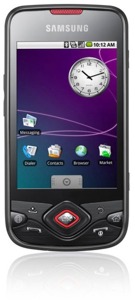
iPhone. In addition to Apple's iPhone, Samsung has also had
success with its Galaxy smartphone series, that uses Android
from Google as an operating system. Another successful
manufacturer of smartphones is HTC, which also uses Android in
many of its models. Also SonyEricsson has a powerful smartphone,
named Xperia and LG has released a powerful smartphone,
named Optimus 2X, that contains a fast dual-core processor. Mobile
phones have now been around for a while in the market, but smartphones
have not been around so long even as Nokia have had models on the market
for many years that at least they claim to be smartphones. But the big
breakthrough for smartphones came when Apple released its
iPhone. In addition to Apple's iPhone, Samsung has also had
success with its Galaxy smartphone series, that uses Android
from Google as an operating system. Another successful
manufacturer of smartphones is HTC, which also uses Android in
many of its models. Also SonyEricsson has a powerful smartphone,
named Xperia and LG has released a powerful smartphone,
named Optimus 2X, that contains a fast dual-core processor.
Microsoft has long tried to enter the market, for example with its
Windows Phone 7 (WP7) system, but the big breakthrough has not come
yet. But this may change now because Nokia and Microsoft
have announced that they will cooperate and develop smartphones
together. Nokia will create the hardware and Microsoft will develop and
maintain the operating system (Windows Phone 7). Both Microsoft and
Nokia have large financial resources and high technical skills, so they
will probably release a lot of interesting mobile phone models in the
future.
The future of mobile phones and mobile e-mail looks very interesting and
all who send out a newsletter must start adapting their newsletters to the
new situation that awaits. Newsletters will be read in mobile phones and
smart phones more often than today.
Do you want to read more articles
and tips?
If you want to read
more articles and tips about e-mail newsletters and related topics you can
follow us on
Facebook or
Twitter, or subscribe on our
newsletter. You can also read our
blog. |
|
|
Related products:
SamLogic
MultiMailer
Other articles
More articles are available from the
article index page.
|

|


