
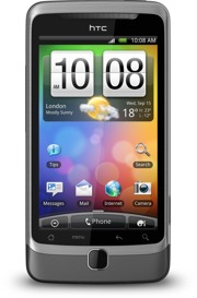 Many people use a smartphone (an advanced mobile phone) to read their email newsletters nowadays. A smartphone of the latest model is so advanced that it can be regarded as small computer. This means that they can run quite advanced software, for example a feature-rich e-mail client, with almost same capabilities as an e-mail client that is run in a large desktop computer.
One important difference
But there is one difference that is important to consider when designing a newsletter that may be read in a smartphone; it’s the fact that the display in a smartphone is much narrower than a computer’s screen.
Do I need to design my newsletter for a smartphone?
As a first step, you should test your newsletter in a smartphone. How does it look like? Some email newsletters may already look good in a smartphone, but some does not. If you are not satisfied with how your newsletter looks in a smartphone, you should consider doing one of these four things:
- Add a link in the top of your newsletter that opens a smartphone-friendly edition of your newsletter.
- Ask the recipient how he/she prefers to read the newsletter (in a smartphone or in a desktop computer) and use two email delivery lists.
- Design a newsletter that look good in both a smartphone and desktop computer.
- Add a script in the HTML that adapts the newsletter to a smartphone or desktop computer.
Read our article
In this article on our website we will describe the four options above in more detail:
> How to Create a Newsletter for a Mobile Phone & Smartphone